Reducing Conversion Friction Without Increasing Traffic
Just trying to increase traffic to your site will not necessarily increase conversion to sales, downloads, etc. If you want to increase conversion metrics it is time to put energy toward UX optimization
Too many clicks are not always a good thing because they can ruin your chances of securing a conversion. You should not have to concentrate on increasing traffic to achieve results, but instead, you should concentrate on enhancing experiences. By concentrating on conversion friction and UX optimization, users can move seamlessly across your site or application without any interruptions.
UX issues, such as complicated forms, non-visible CTAs (Call to action), or mandatory account sign-ups, lead to over 70% cart abandonment (Baymard Institute). On the other hand, AliExpress proved that new-user conversion increased by 104% because of a faster, mobile-optimized PWA (Progressive Web App). These cases confirm that revenue and engagement are directly improved when conversion friction is reduced.
Why UX-Driven Conversion Is Essential
UX should be simple and reduce the amount of work needed to carry out a task, and at the same time guide the users' actions toward the objective of the business. A bad user experience creates a lot of confusion, and possible users drop off. A good user experience creates a confident user and positive user experience metrics.
Because of the overall user experience, every single action that a user can take on the site, including navigation menus and form fields, can be a barrier to action completion. By isolating small user experience refinement areas, you reduce the cost of user acquisition and improve user experience.
How to Reduce Conversion Friction with UX-Driven Strategies
This is about designing user experiences that are frictionless. Each phase of the user's journey provides the opportunity to create a path toward a conversion goal or a roadblock. Below, we describe the techniques used to convert.
Streamlined Visual Hierarchies
Users scan for important information as opposed to detailed reading. Visual hierarchies help reduce decision fatigue by guiding the user to important actions. Good visual hierarchies make use of good contrast, spacing, and size to make important information clear while not providing explicit instruction. An example of good visual hierarchy can be a bolt that solidifies the “start trial” CTA on the onboarding screen. Good visual hierarchy can increase rates of micro conversion.
Heatmaps and eye-tracking studies reveal how users naturally prioritize elements. A/B testing alternative layouts, varying CTA size, grouping related form fields, and adjusting whitespaces can confirm which structure accelerates user progression without introducing cognitive overload.
Mobile-first interaction design goes beyond responsive layouts, considering thumb zones, tappable areas, and microinteractions. A PWA or mobile-optimized onboarding that reduces scrolling, anchors primary CTAs, and breaks steps into segments can improve task completion rates by 15–25%.
For a deeper look at designing micro-interactions that keep users engaged and reduce drop-offs, check out our blog on, The 'Magic Moment' Prototype: The Single Feature That Hooks Users.
Cognitive Load Reduction in Forms and Processes
Every additional field or ambiguous label adds conversion friction. Experts reduce cognitive load by applying progressive disclosure and eliminating unnecessary decision points. Merging multi-step processes, auto-filling known information, and deferring optional account creation until value is established prevents drop-offs.
For example, an e-commerce platform saw a 12% lift in checkout completions after consolidating its five-step form into two core steps, while retaining optional upsell sections unobtrusively.
Accessibility and Inclusive Interaction Patterns
Accessibility is both ethical and strategic. Features such as high-contrast visuals, ARIA-compliant form elements, and keyboard-navigable interfaces not only meet WCAG standards but also reduce friction for all users. Observational usability testing can uncover hidden pain points, like dropdown menus that fail on screen readers, allowing teams to optimize flows for broader adoption.
Persuasive Microcopy and Contextual Visuals
Language and imagery act as subtle conversion friction reducers. Microcopy that clearly communicates outcomes, such as replacing “Submit” with “Start Free Trial,” reduces hesitation. Similarly, contextual product imagery or explainer micro-videos reinforce understanding without requiring users to interpret abstract instructions.
Progressive disclosure ensures that details appear as the user demonstrates intent, preventing cognitive overload while guiding decisions fluidly.
Performance UX Optimization
Speed remains a core friction point. Core Web Vitals, including Largest Contentful Paint (LCP) and Cumulative Layout Shift (CLS), are reliable predictors of bounce behavior. Compressing media in modern formats, deferring non-critical scripts, and leveraging edge caching ensure that users experience instant feedback and uninterrupted interactions.
For example, you can reduce your app or site’s load time by optimizing images, scripts, and server response.
Continuous Feedback Loops and Iterative Testing
Data-driven iteration separates expert UX design from assumptions. Analytics reveal drop-off points, but qualitative insights, session recordings, usability interviews, and targeted surveys expose the underlying friction causes. By formulating hypotheses, running A/B tests, and measuring task completion or engagement metrics, teams create a self-reinforcing cycle of incremental improvements.
Even a small cohort of five users per month can reveal recurring friction points that analytics alone might overlook. Ethical experimentation ensures learning scale without compromising user trust.
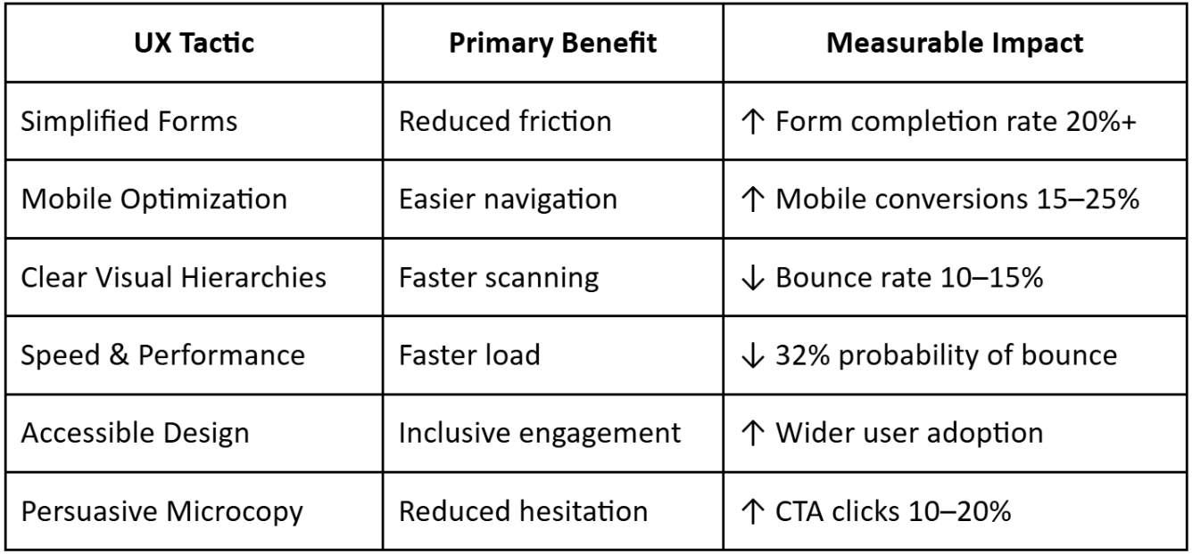
Table: Key UX Tactics vs. Business Impact
Conclusion
Reducing conversion friction is often more effective than increasing traffic. Every micro-improvement, simpler forms, better mobile flows, clearer messaging, faster pages, compounds into higher conversions, stronger trust, and happier users.
Focus on measuring, testing, and iterating. Your users will appreciate a smoother journey, and your business will see the results without paying for extra clicks.
More to Explore
research
How UX Debt Accumulates in Healthcare Products
research
Designing for Health Literacy: A UX Framework
research
Does Your Product Need a Consultant or an In-House Designer Right Now?